Pie Bar
Brand Identity
Brand Guidelines
Packaging Design
Collateral
2017
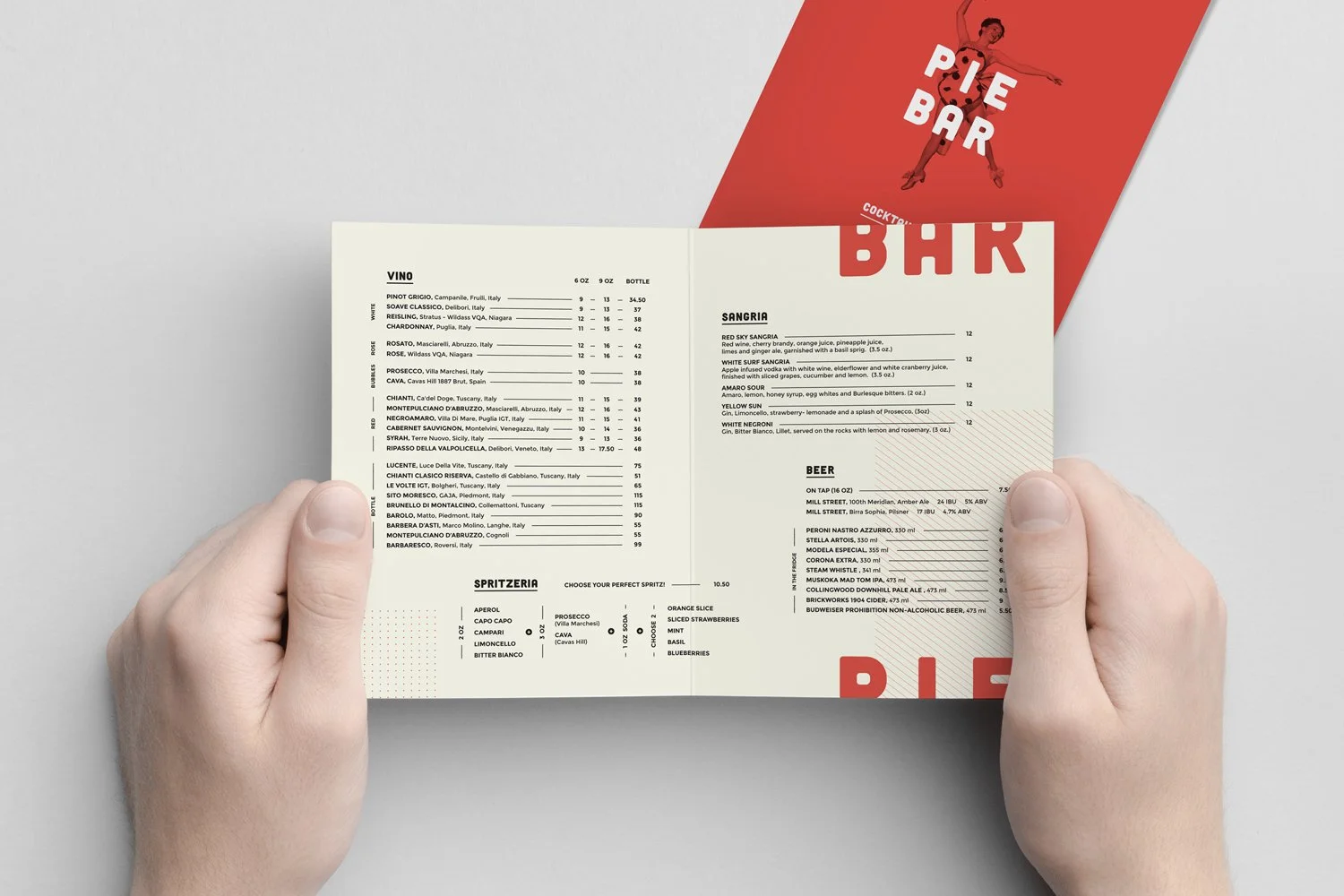
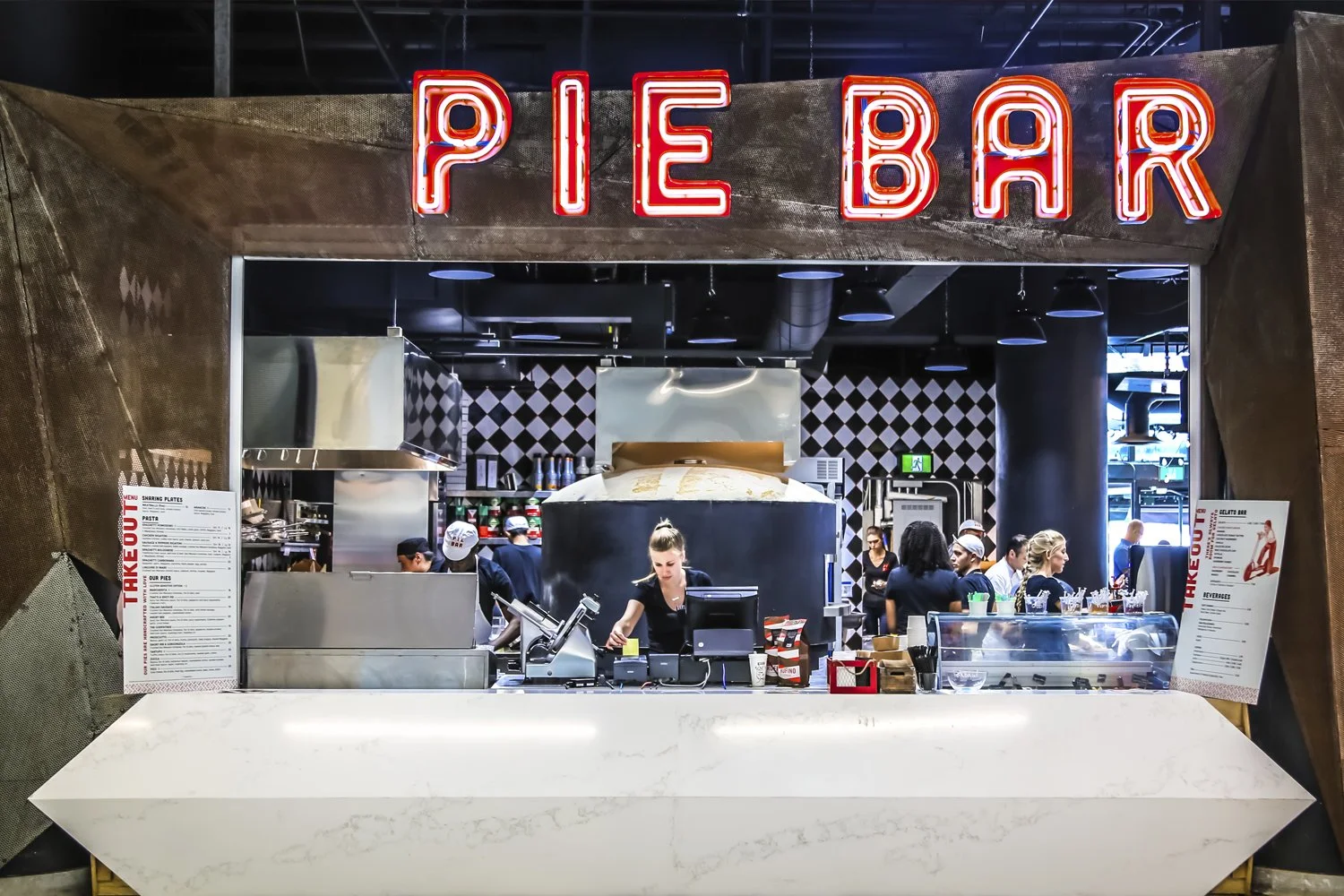
The Fab Restaurant group, known for their long-running and well-liked Toronto pubs, decided to diverge from their current offering and open an Italian restaurant right on Toronto's waterfront. They wanted to create an experience that was a little left of centre and delivered the unexpected to their guests - whether that was in the form of quirky ingredient pairings on their signature pizzas or their indulgent gelato bar where patrons could build their own creations.
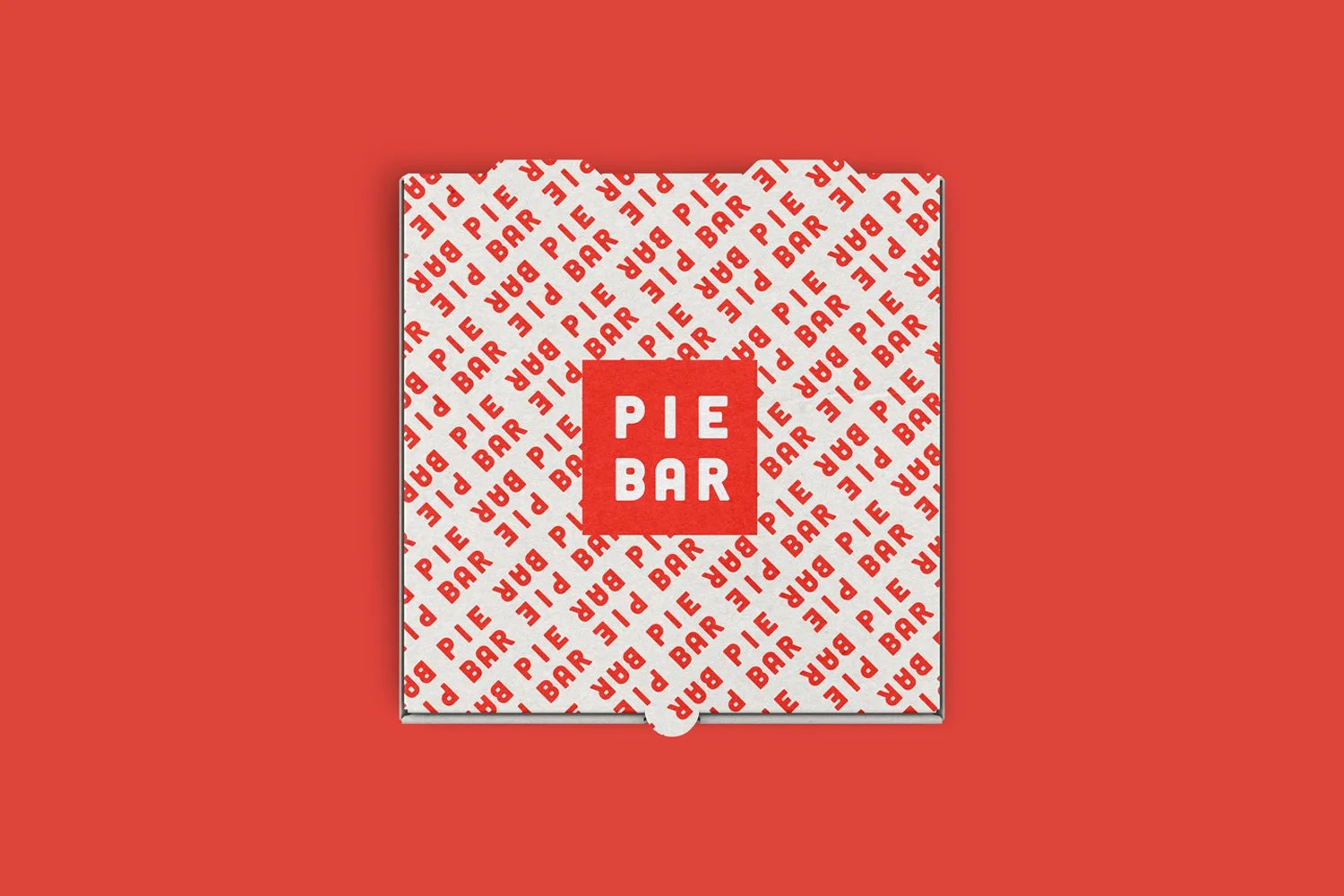
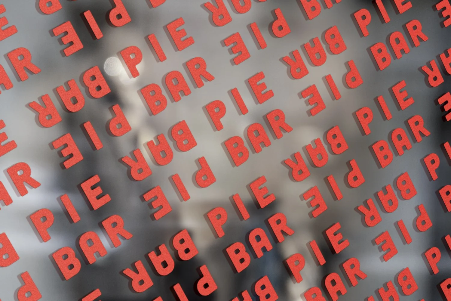
Awake created an identity that also brought that sense of the unexpected to the experience. Custom-made typography was created which helped to communicate in a unique and appealing manner, complemented by quirky retro-inspired cut-out photography, all supported on an unflinchingly strong vermillion background.
The summer 2017 launch of the brand was a roaring success with talk about other possible locations in the future.
-
![An image of the Cultural Center.]()
01
-
![An image of the Cultural Center.]()
02
-
![]()
03
-
![Three women in vintage clothing striking different poses against a red background, with text reading 'Pie Bar' over each woman.]()
04
-
![View of a pie bar restaurant with staff preparing food behind the counter and a large neon sign that says 'Pie Bar' above the counter.]()
05
-
![Red stickers with the words 'PIE BAR' on a glass surface in a repeated pattern, slightly rotated.]()
06