Cirse Yoga
Brand Identity
Brand Guidelines
Collateral
2021
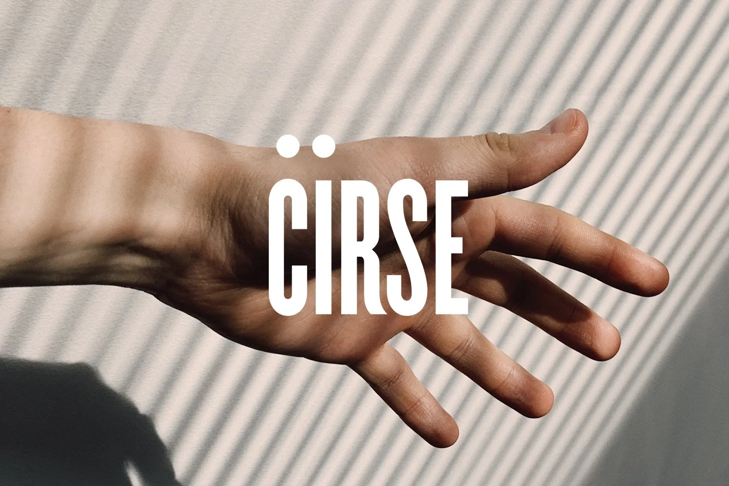
Cirse Yoga is a UK-based yoga brand, run by husband and wife duo Karen and Pete Cherry. “Cirse” (sir-say) is the Gaelic spelling and pronunciation of Cherry which they decided to use to create a connection to their own name.
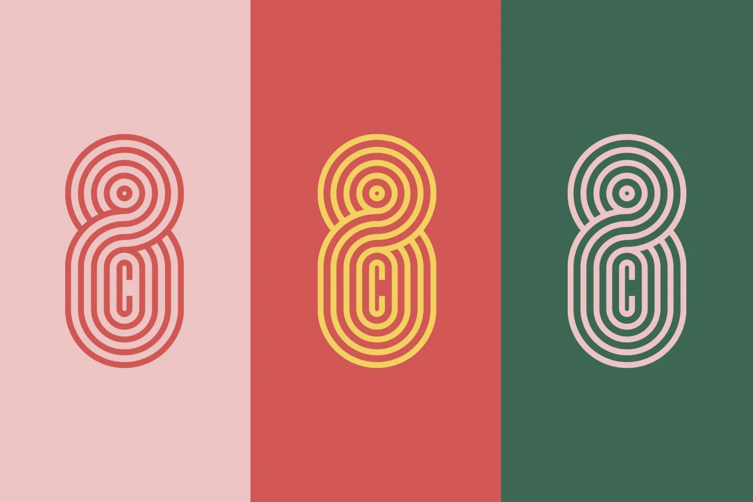
The logo’s two floating dots create a figurative illusion with the “C” of Cirse forming an abstract Camel Pose. The letterforms of the R and the S melt into each other to reference the fluidity of the poses in yoga practice.
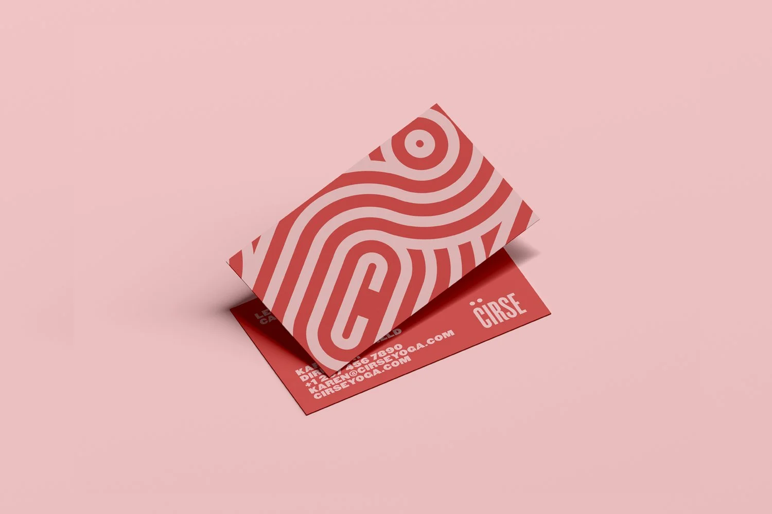
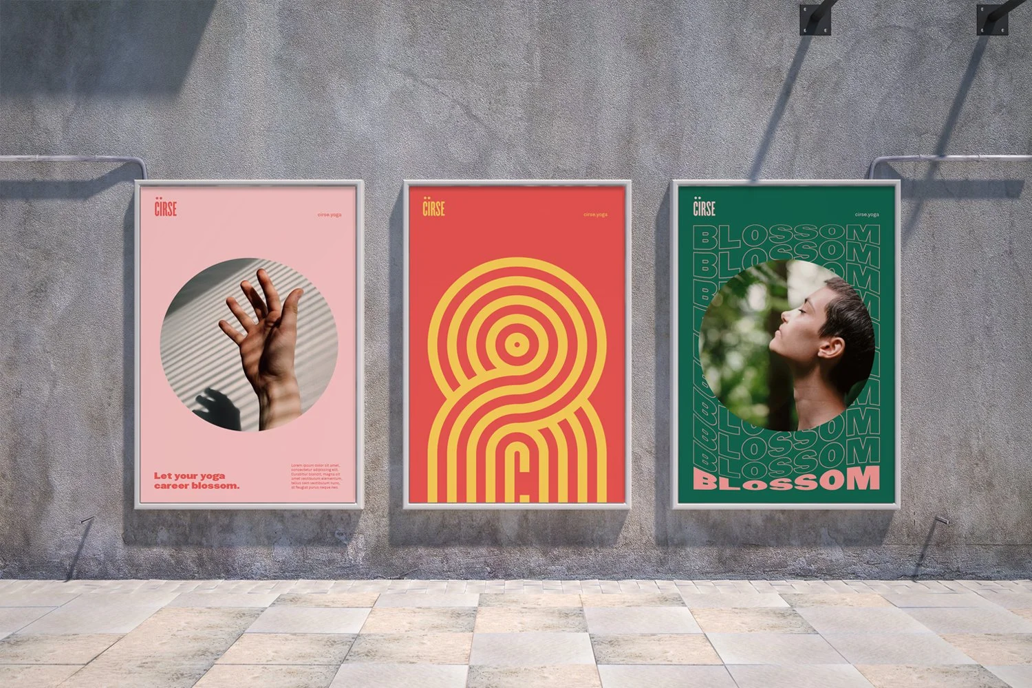
The palette is inspired by cherries and manages to feel sweet but arresting. This is paired with grittier imagery to create a sense of contrast and to underscore the work and stamina that’s needed to fully commit to a yoga practice.
Cirse. Let your yoga practice blossom.
-
![An image of the Cultural Center.]()
01
-
![An image of the Cultural Center.]()
02
-
![]()
03
-
![A printed instructional sheet titled 'Prone Scapula Setting' with a photograph of a woman in a yoga pose, demonstrating a prone position, against a plain background. The sheet contains text with information and tips about the exercise.]()
04
-
![A series of instructional fitness posters demonstrating different yoga poses, including Cobra, Boat, and other poses, with step-by-step images and written instructions on how to perform each pose.]()
05
-
![Three white tote bags with red number 8 designs on a gray surface.]()
06